Thursday, 10 October 2013

Living room

In the living room I began by painting the ceiling with the same white silk emulsion I had used in the kitchen.  When I first put my house together I'd originally painted the banister and staircase white but this didn't look quite right now somehow.  In my research I discovered that brown was a popular choice for staircases in the 1930s and 40s so brown it was! I didn't have a brown coloured paint so I mixed my own brown colour using the colours I did have - scarlet red, ochre yellow, olive green and black acrylic paint which gave me just the right colour I was looking for.  I was very pleased with the results - very retro!


I then looked at my room and realised it needed a focal point.  There was no chimney breast wall (as both chimneys are on the side of the house) in the centre of the room to make the fireplace the main feature so I decided to create my own.  My Grandad used to have a wonderful Art Deco tiled fireplace in his living room and I wanted to create the same look.  To construct my wall I used a box made of very strong cardboard and cut it down to the size I wanted.  I then covered it using the cardboard from the back of a writing pad to make the shape neater and more sturdy.  I glued the box and fixed it to the wall then I left it to dry.  For my living room wallpaper I used the 'Roman Swag' Art Deco wallpaper from the Dolls House Emporium.  I measured the lengths I needed making sure that all the pieces would match when it was hung on the wall and I glued my paper to the wall using ordinary wallpaper paste.  I painted the back of the paper using a medium sized paintbrush and starting at the left hand corner of the back wall I begun hanging it piece by piece.  I smoothed out any bumps and bubbles along the way using a dry, scrunched up piece of kitchen roll.  I left the left side wall until last.  That was the part I was least looking forward to doing as I'd already glued the banister to the wall! Ooops! To paper this bit I measured, cut and hung a piece which stopped just short of the hand rail.  Next I cut another piece roughly 2 inches wide to piece around the banister.  I measured where the banister came to and made a vertical cut up the paper (slightly higher than the height of the banister) then made cuts at 12, 1, 3, 5, 6, 7, 9 and 11 o' clock so I had what looked a bit like a fairy wand shape in the wallpaper (see picture below).


Once I'd done this I pasted the paper and attached it around the banister smoothing it down so there were no gaps or mismatched pieces in the paper.  Finally I pasted the last piece and attached it to the wall, again making sure the wallpaper matched.  Once the paper had fully dried I cut the ragged pieces around the banister using a sharp Stanley knife.   I'm planning on putting coving at the top of my walls and skirting boards at the bottom so I am not too bothered that the edges of my wallpaper aren't perfect.  This is what the room looks like fully papered..


Next for this room I need to decide on what type of flooring to have and at the moment I'm thinking painted/ varnished floorboards with a nice little rug in front of the fire.  I've already seen the perfect fireplace just like my Grandad's which is from Hearth and Home Miniatures.  It is pretty expensive but I think it'll look amazing.  Here it is..


Monday, 7 October 2013

Inspiration for my kitchen

I've found Pinterest a wonderful source of inspiration for my doll house.  I love these images from the Cats, Dogs and Eiderdowns blog of the Imperial War Museum - this is exactly the kind of look I want to achieve in my kitchen.


I love that the floor tiles look old and grimy - mine are far too clean at the minute so I'm going to try and make them look more 'lived in'.  Not sure how I'm going to do it yet and I don't want to ruin them either so if anyone has any tips - please get in touch! I also want a drop-leaf kitchen cabinet similar to the one in the photograph to store my kitchenware.  Jane Harrop does a great tutorial for one in her book 'Thirties and Forties Miniatures in 1/12th Scale' but she also sells the kits on her website so I think I might buy one instead.  At least then all I would have to do would be to glue it together and paint it! A basket like this one would also look great in my kitchen along with a miniature ration book and full of groceries.  The photograph below is not one of my own but was another one I found on Pinterest. This is the 1930s/1940s kitchen on display at York Castle Museum.  We visited the museum a few years ago and it is well worth going.  This was part of an exhibit about British kitchens through the ages - there was a Tudor kitchen, an Edwardian cottage kitchen, this kitchen and a 1980s kitchen.  The installations are amazing, it's just a shame you can't get in the kitchens to have a good nose around and pretend you're part of a period drama!  Or maybe that's just me :-)


Sunday, 6 October 2013

Sink, shelves and cooker

Today I began painting some of the parts for my cooker.  The cooker I've chosen for my kitchen is a Phoenix 1940's gas stove which arrived last week in loads of tiny little pieces which was a bit of a shock because I thought it would come ready made (silly me for not checking the small print!) So, before I assemble it I'm painting the parts first.  I've been using Humbrol enamel paints in white gloss and matt duck egg blue to paint the door, sides and top of the cooker.  I've ordered some black paint to paint the inside and stove tops.  It's the first time I've ever used enamel paint before but I'm pretty pleased with the results so far.  The duck egg colour covered well and seemed to dry a lot quicker than the white gloss.  Saying that, the gloss is a lot thicker, but the most frustrating part is it takes literally forever to dry and gets covered in little bits of dust as it's drying.  I'm going to leave it to dry overnight and see if sanding it a little may help.  While I was waiting for the cooker parts to dry I decided to have a little go at making my own enamelware pans.  I used two metal baking trays and a set of three silver metal lidded pans.  I painted them with a couple of layers of the white gloss paint and I plan to order another pot of enamel paint in either royal blue or emerald green to give them that old fashioned enamel cookware look.  I was thinking of chipping little bits of paint off them and making them rusted in places so they'll look well used.  I'll see how they turn out after I paint the trim on them.


Next I glued the brick pillars to my Belfast sink.  I bought the pillars a few weeks ago but wasn't really happy with the finish.  They're made from some sort of resin with a dark red brick effect printed on them and to be honest they looked a lot better in the photograph on the website but it wasn't a big deal as I already had some red brick slips and mortar to cover them up with.      


Whilst the front facing bits don't look perfect, I'm a lot happier with how they look now.  I also have a wood effect draining board to go with the sink unit so I just have to decide now where it's going to go.  I think I'll make my mind up once I've got all my furniture in the kitchen.  

I filled the gap around the pantry wall by using a long piece of dado rail to cover the section coming down the stairs, and for the vertical gap at the bottom of the stairs I packed it with a thin piece of wood and covered with decorator's caulk.  Once the caulk had dried I painted it white so it looked like it was part of the staircase.  

Finally I glued the long shelf to the wall on the right hand side of the kitchen.  I will fit the brackets underneath it tomorrow and I will have a think what kind of things I can display up there.  Perhaps some pots and pans, plates, cooking utensils or books.  I want to put as much stuff up there as I can - I want my kitchen to look 'lived in' so the more clutter the better!  This is how the room looks so far today...


Friday, 4 October 2013

Pantry shelves and wall

I bought some strips of wood to make the shelves inside my pantry.  The pack of wood came in 6 long strips which were 1.8cm wide x 0.4cm thick.  I cut 4 pieces which were 11.5cm in length using a Stanley knife.  I sanded the edges and gave them two coats of brown acrylic paint.  Once they had dried, I turned my dolls house over so the back of it was flat on the floor.  On the back wall I marked the positions for each of the four shelves, spacing them 4cm apart.  I then glued them into position with wood glue and left the house on it's back until they had dried.  In this photo I have put the pantry wall in place to see what they would look like.


I was advised by older members of my family that everyone used to decorate the front of the shelves in their pantries and cupboards with patterned wallpaper so I decided to make some of my own.  To make my shelf embellishments I picked some ribbon I had by East of India and cut it along the middle.  I then cut four pieces of paper the same length as my shelves and 0.5cm thick.  I glued the ribbon to the paper using tacky glue and left to dry.  I backed the ribbon with paper so they would hold their shape better and the brown of the shelves wouldn't bleed through the ribbon.


  I applied glue to each of the shelves and stuck on the ribbon embellishments.  


Finally I glued the wall in place.  There are gaps but I will fill these with wood filler and repaint.  I love this look! Now all I need are some things to go in my cupboard - tins of food, preserves, vegetables, cleaning products, plates and pans etc.  That will come later.  Next I will fit my last piece of dado rail, put up my wall shelves and put my sink together.


Thursday, 3 October 2013

My dolls house

Sorry it has been a while since my last update - I've been busy working on my dolls house.  I want to show you my progress from start to finish so here is what I've done so far...

For my 30th birthday my fiancé bought me a Magpies shop kit from the Dolls House Emporium.  As I couldn't make up my mind what kind of 'shop' it should be it has sat half finished in the corner of my living room for the past two years.  During that time I have imagined it as a Victorian toy shop, a florist's, a tea room, a cafe/ deli and an Italian restaurant - I could never decide!


Last month I finally decided on a theme I was happy with - 1940s living quarters with a general store below so I set to work planning how I would decorate my house/ shop.  I've always been fascinated by WW2 and what life and living conditions were like in Britain so I found Pinterest a very useful source of information for 1930s/ 1940s decor... colours, wallpaper patterns, furniture styles.


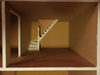
During the war, the kitchen was the heart of the home so I thought that this would be a good place to start.   The photograph above is what my kitchen looked like before I made a start on it. In many of the kitchens I looked at on Pinterest I found that yellow/ magnolia and green were popular colour choices for the walls.  I began by painting the ceiling with some leftover white vinyl silk paint.  I used about three or four coats to get a decent coverage over the MDF.  I then painted the kitchen walls and back staircase wall with a Dulux paint tester pot in 'Buttermilk'.  This took three coats.


Once this had dried  I measured 3.5 inches from the kitchen floor and drew a straight line in pencil around the walls.  Using the line as a guide, I painted the bottom half of the wall in a dark green coloured paint by Dulux called 'Heathland'.  I deliberately chose a shiny, gloss type paint as during this time walls would have been painted with gloss for practical reasons as it was easily washable.  I tried to get a straight line as best I could but it every time I tried I just kept messing it up.  I think it may have been a lot easier had I painted the walls before gluing the kit together but nevermind! My fiancé suggested using a dado rail or a wallpaper border which would make the finish look neater.  I decided to go for a thin picture rail to use in place of a dado rail as I didn't want it to be too big or protrude too far from the wall.  I will add this later...

I gave the staircase a coat of white satin paint.  I didn't want the stairs to be too shiny so I chose this instead of gloss paint (which also tends to go yellow after a while).  I then looked at kitchen flooring and decided to go for black and white square tiles as they were pretty popular in kitchens during that time.  I fell in love with some black and white stone tiles but they were so expensive and I thought that because the kitchen was on the first floor it would be unlikely that stone tiles were laid on wooden floors.  Instead I found some vinyl black and white tiles by Richard Stacey which have more of a linoleum look which I'm very pleased with. They were very easy to lay as well... time consuming but easy.  I started in the bottom left hand corner and glued them in place using tacky glue.  I glued tiles in the space under the stairs as well (even though you won't see all of them) I thought that this would be much easier before I attached the pantry wall.


It was not until the 1950's that fitted kitchens were introduced so I realised that I had to make the best use of space in my kitchen.  I was keen to turn the space under the stairs into a pantry where the homeowner could store food items, pans and cleaning products.  To create my pantry I measured the space under the stairs and my uncle cut the shape out of plywood for me (I have no woodworking skills whatsoever!).  I sourced the perfect door for my pantry from the Dolls House Emporium.


I glued it together so it opened out to the left rather than the right (which would block the wall space on the right side wall).  I then painted it in the same dark green colour I used for the bottom half of the walls.  I drew around the door on the plywood shape and my fiancé cut it out.


I sanded down the rough areas and glued the door in place.


I have ordered some shelves to go inside my pantry so I will fit these before I glue the plywood wall section in place.  This is an idea of what it will look like in the room once it is fitted in place...